How to Audit a Mobile Landing Page: A 5-Point Framework (Live Case Study)
Over 80% of paid social ad traffic lands directly on a mobile screen. Yet, most mobile landing pages bleed conversions quietly because of three or four subtle friction points.
When most people talk about Conversion Rate Optimization (CRO), they make it sound complicated. They talk about private Google Analytics 4 setups, heatmaps, $5,000 software stacks, and enterprise A/B testing tools.
If you are a student, an early-career marketer, or a founder, you usually do not have backend access to a brand’s analytics. But that does not mean you cannot analyze their marketing.
You can run a complete heuristic conversion audit using entirely public tools.
In this breakdown, I took a live Meta ad spending heavily in Europe, traced its path straight to the mobile checkout on my phone, identified four major conversion leaks, and rebuilt the top fold in Figma.
Here is the exact 5-point framework you can steal for your own projects.
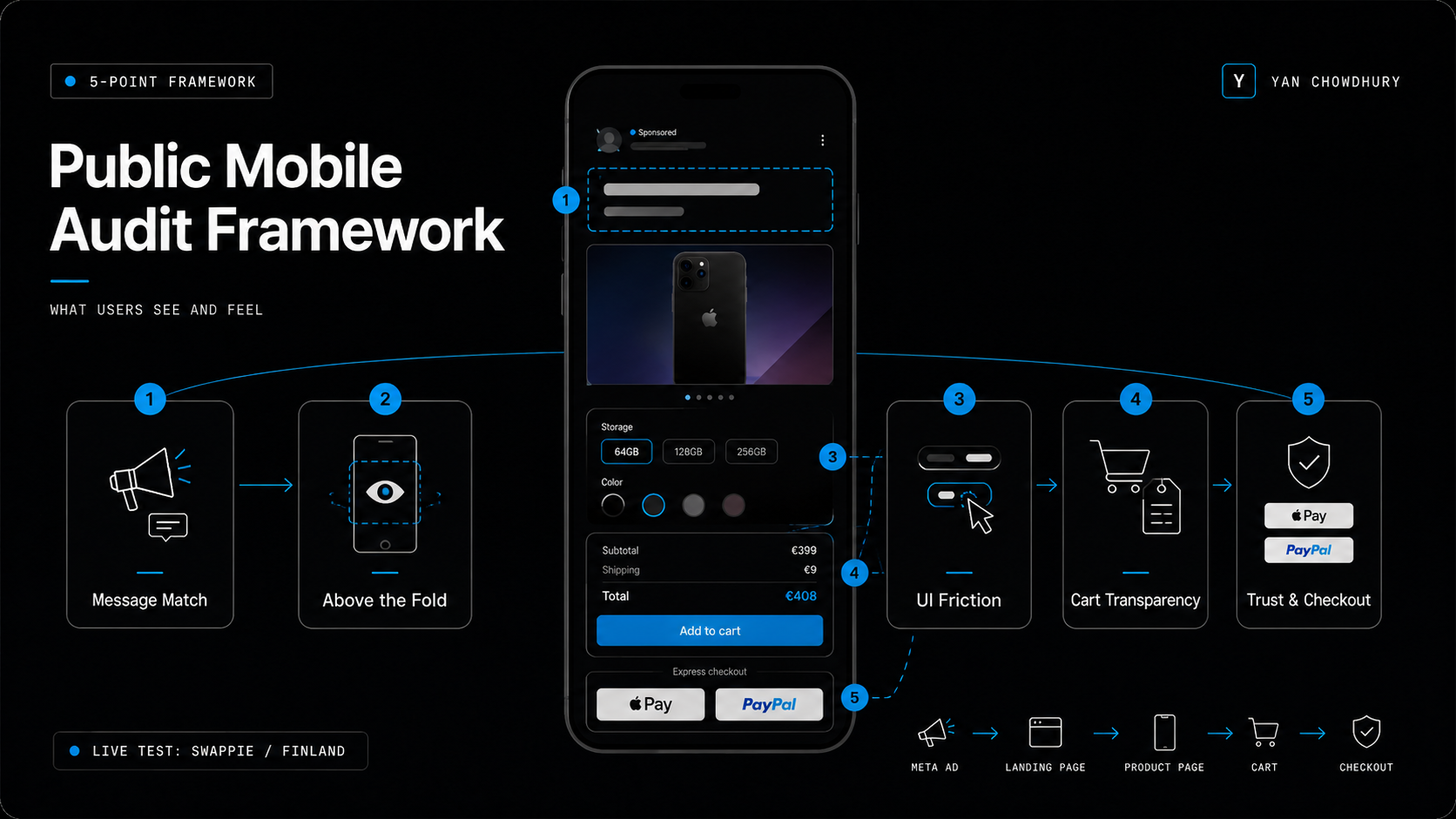
The 5-Point Public Mobile Audit Framework
When you do not have private backend data, you evaluate what the user actually sees and feels during the journey. The goal is to reduce cognitive load, eliminate confusion, and clear the path to purchase.
Here are the five checkpoints:
Message Match: Does the landing page headline echo the exact hook, offer, and visual promise of the ad?
Above-the-Fold Clarity: Can a cold user answer what it is, who it is for, and what to do next within 5 seconds without scrolling?
Selection & UI Friction: Is choosing product options (size, color, storage) effortless, or does the UI interrupt the purchase momentum?
Cart Transparency: Are prices, variations, and additional fees kept honest throughout the flow?
Trust & Express Checkout: Are risk-reducing trust badges and quick payment options placed directly where decision anxiety peaks?
To test this framework in the real world, I selected a major Nordic D2C scaleup: Swappie.
Swappie sells refurbished iPhones across Europe and spends heavily on Meta ads. For this test, I took an active Meta ad targeting Finland (with over 400,000 reach) and followed the cold user journey on camera.
Diagnosing 4 Conversion Leaks in a Live Mobile Funnel
Leak 1: Message Match Failure & Top-Fold Clutter
The Meta ad creative promised a clear, affordable benefit: buy a high-quality refurbished iPhone 11 at a great price.
However, when you click through on mobile, the product hero page greets you with competing attention drivers.
Instead of reinforcing the affordable iPhone 11 promise, the top of the screen displays a bright yellow promotional banner pushing a free audiobook subscription to Storytel.
[ Active Meta Ad Hook ] ──> "Affordable Refurbished iPhone 11"
                                 │
                                 ▼
[ Mobile Top-Fold ]     ──> 🟡 Bright Yellow Banner: "Free Storytel Subscription!"
                            ❌ Dilutes Value Proposition
                            ❌ Competes for Cold Attention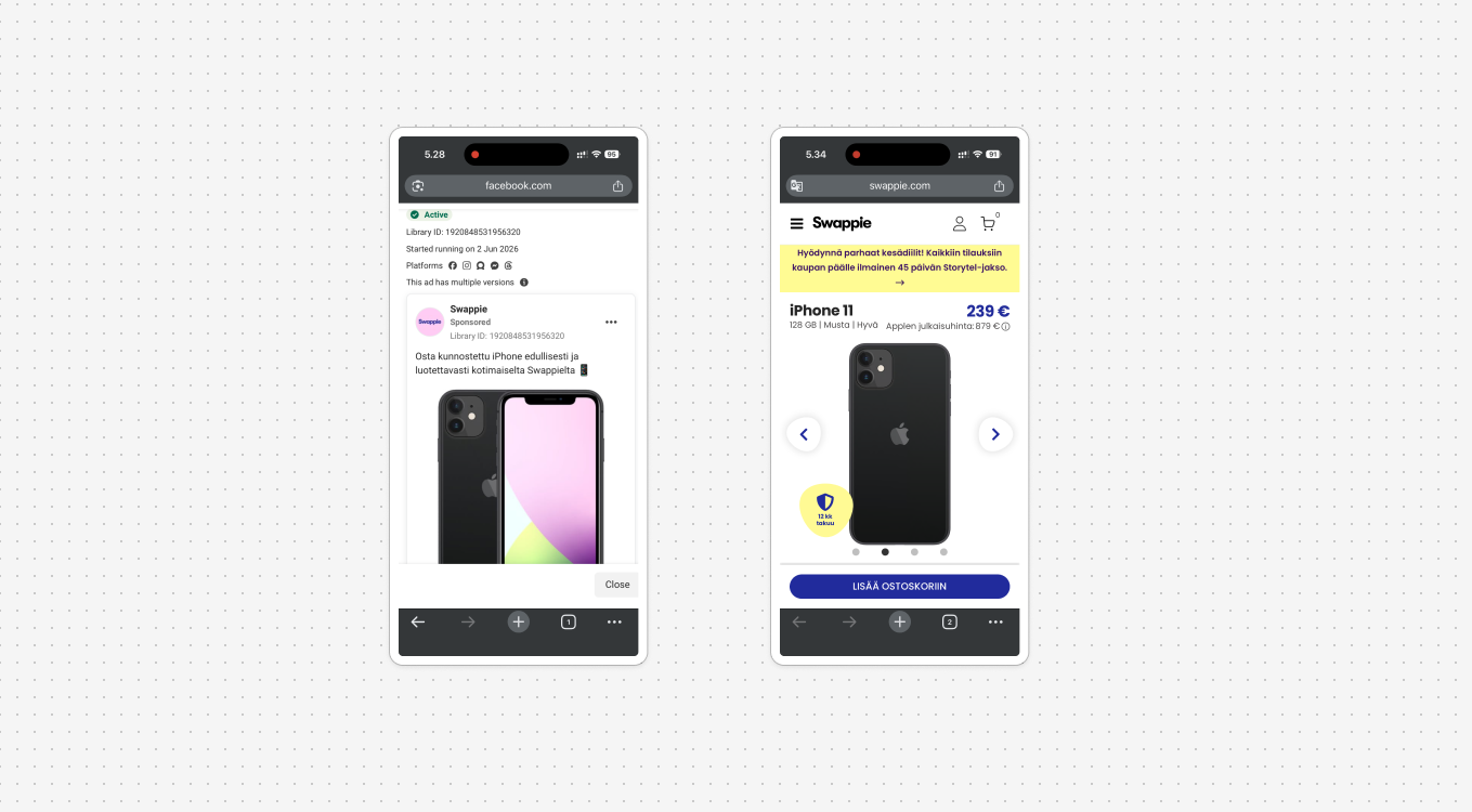
When cold traffic lands, secondary promotional clutter increases cognitive load. The primary action button gets pushed down the page, making the main value proposition feel fragmented.
The Fix: Remove unrelated brand partnerships from the hero fold. Keep the primary headline tightly matched to the ad copy that earned the click in the first place.
Leak 2: The Multi-Step "Upsell Wall"
Action friction is the silent killer of mobile conversion rates.
On Swappie’s mobile product page, once you select your phone and tap the primary blue button ("LISÄÄ OSTOSKORIIN" / Add to Cart), you do not go to your cart.
Instead, the site forces you through two consecutive accessory store pop-up pages (Lisätarvikkeet).
The screen aggressively pushes a 15.90 € screen protector. The primary, prominent blue button on this page does not proceed to checkout—it adds the accessory to your bill. To skip this upsell and continue with just your phone, you have to locate a small, low-contrast button at the bottom ("Jatka").
[ Select Phone ] ──> [ Tap "Add to Cart" ] ──> 🛑 FORCED UPSELL 1 (Screen Protector)
                                            ──> 🛑 FORCED UPSELL 2 (Cases/Chargers)
                                            ──> ⚠️ High Drop-Off Risk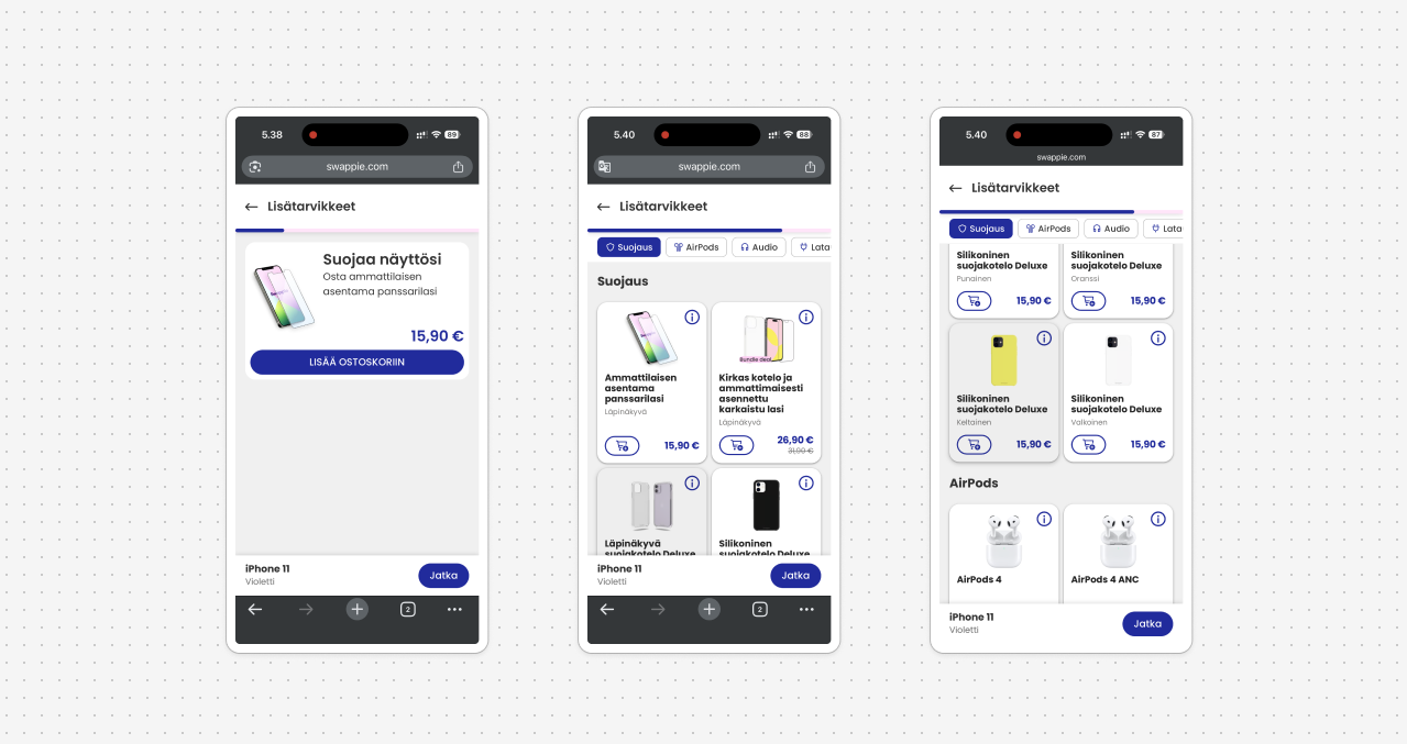
Intercepting high-intent mobile buyers with mandatory multi-step upsell walls creates immediate annoyance. Every extra tap or confusing button placement gives a buyer a reason to close the tab.
The Fix: Replace multi-page forced upsells with an optional slide-out cart drawer or inline add-ons on the product page.
Leak 3: Silent Variant Drift
This was the most critical technical finding during our live audit.
On the product page, I selected a Black 128GB iPhone 11 model priced at 239 €.
After navigating through the multi-step upsell screens to reach the cart summary, the system silently updated the selected item to a Violet 128GB model priced at 229 €.
[ Product Page ] ──> Selected: Black 128GB (239 €)
                         │
               (Navigating Upsell Screens)
                         │
                         ▼
[ Cart Summary ] ──> Product: Violet 128GB (229 €) ❌ SILENT VARIANT DRIFT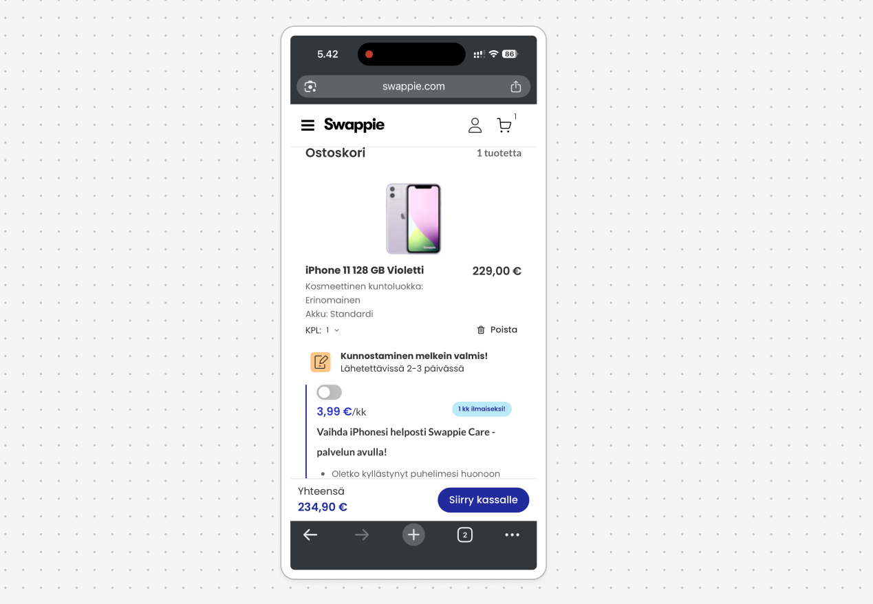
When URL parameters or inventory logic silently swap product variants inside a cart, buyer trust drops to zero. Imagine ordering a sleek black phone and opening a package containing a purple or pink one. Technical system errors like this break conversion momentum completely.
The Fix: Ensure robust inventory logic state-checks so the exact variant selected on the product page matches the cart payload 100% of the time.
Leak 4: Automatic Fee Shock
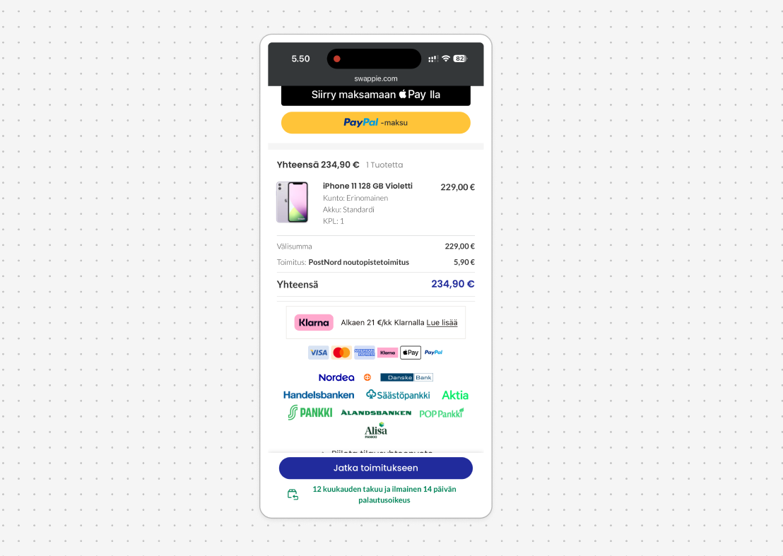
When you reach the cart calculation screen, a 5.90 € standard delivery fee (Standarditoimitus) is automatically added to the cart total before you have even typed in your address or selected a delivery method.
This automatically jumped the listed order total from 229.00 € to 234.90 €.
Unannounced fee additions inside the cart cause immediate price shock. Unexpected extra costs are consistently cited in e-commerce research as a leading driver of cart abandonment.
The Fix: State shipping terms clearly on the product page (e.g., "Shipping calculated at checkout" or "Free shipping over 50 €") so the price total never catches the buyer off-guard.
What They Execute Brilliantly (CRO Wins)
A fair audit is never just about pointing out flaws. To build real authority as a marketer, you must analyze systems objectively and recognize strong execution.
Once you bypass the initial friction points and reach Swappie’s final checkout screen (Kassa), their mobile CRO execution is top-tier for the Nordic market:
Express Checkout Hierarchy: They place Apple Pay and PayPal at the very top of the checkout form, allowing mobile users to purchase in two taps without manually typing billing addresses.
Local Trust Signals: They prominently feature local Nordic bank payment badges (such as OP and Nordea). In Finland, direct bank transfers are widely trusted and preferred for online shopping.
Risk Reversal Anchors: Clear badges highlighting their 12-month warranty and fast shipping remain visible near the payment CTA, reassuring the buyer right at the point of purchase.
The Figma Wireframe Fix
To turn an audit into an actionable asset, you need to show how to fix the problem visually.
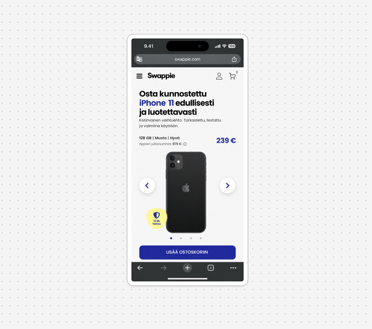
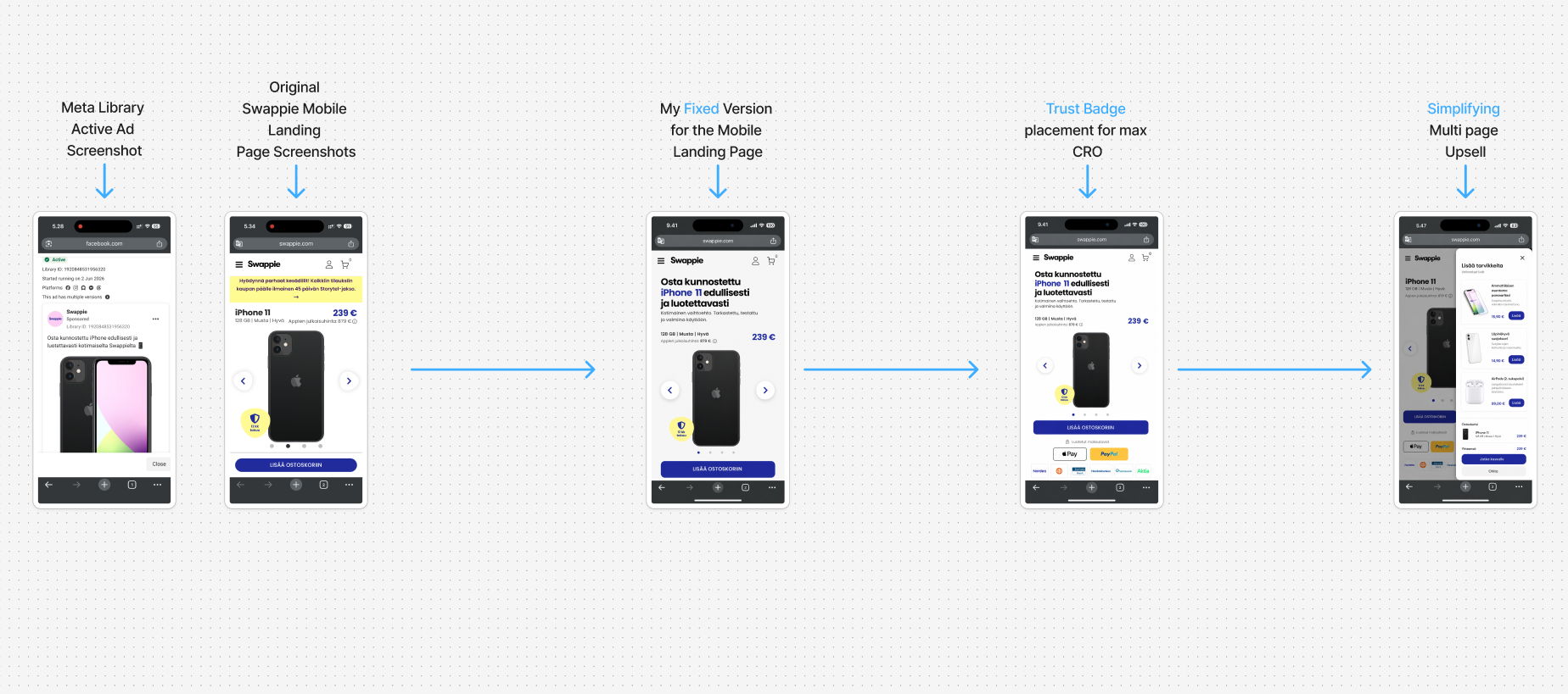
Inside Figma, I built a simplified, high-converting mobile top-fold wireframe designed to eliminate the initial conversion leaks while preserving what Swappie does well.
+-----------------------------------------------+
|  [ Header: Logo + Cart Icon ]                 |
+-----------------------------------------------+
|  HEADLINE: Osta kunnostettu iPhone 11         |
|            edullisesti ja luotettavasti       |
|  (Direct Ad Match: Affordable & Reliable)     |
+-----------------------------------------------+
|                                               |
|               [ iPhone Image ]                |
|                                               |
+-----------------------------------------------+
|  PRICE: 239 €                                 |
|  [ PRIMARY CTA: VALITSE MALLI & VÄRI ]        |
+-----------------------------------------------+
|  TRUST ROW:                                   |
|  [ 12 KK TAKUU ] [ APPLE PAY ] [ NORDEA/OP ]  |
+-----------------------------------------------+
Key Redesign Improvements:
Direct Headline Alignment: Updated the hero headline to match the Meta ad promise directly (Osta kunnostettu iPhone 11 edullisesti).
Eliminated Visual Clutter: Removed the secondary Storytel banner entirely to keep the user's focus on the phone.
Immediate Trust Placement: Placed warranty anchors and payment trust badges directly beneath the primary action button.
Slide-Out Cart Drawer: Replaced mandatory multi-page upsell screens with a clean, slide-out drawer that confirms the phone selection smoothly before offering optional accessories.
How to Build Portfolio Assets with Public Audits
You do not need to wait for a client or a job title to practice real-world performance marketing.
If you are a student or an early-career marketer looking to stand out:
Pick an active brand running paid ads in the Meta Ad Library or Google Ads Transparency Center.
Run their mobile landing page through this 5-point audit framework on your phone.
Document the friction points with clean screen recordings and callout boxes.
Build a quick before-and-after wireframe in Figma showing your proposed layout fix.
Publish your teardown on LinkedIn or your personal website as a case study.
This single workflow demonstrates strategic thinking, UX awareness, and practical execution far better than a standard resume ever could.
